Storybook v5.2 で新しいストーリーのフォーマット・Component Story Format(CSF)が導入され、今までの storiesOf から置き換わることが想定されています。今後に備えて簡単に素振りしつつ、その良さについて触れていきます。
実装したリポジトリはこちらです;
https://github.com/suzukalight/study-storybook-component-story-format
速攻で試す
何はなくとも、まずハンズオンしてみるのが良いと思います。下記の手順で試せます;
$ npx create-react-app study-storybook-component-story-format --typescript
$ cd study-storybook-component-story-format
$ yarn add -D @storybook/react babel-loader @babel/core @babel/plugin-syntax-jsx
"scripts": {
    "storybook": "start-storybook"
  },
import { configure } from '@storybook/react';

configure(require.context('../src', true, /\.stories\.tsx$/), module);
import React from 'react';
import { Button } from '@storybook/react/demo';

export default { title: 'Button' };

export const withText = () => <Button>Hello Button</Button>;

export const withEmoji = () => (
  <Button>
    <span role="img" aria-label="so cool">
      😀 😎 👍 💯
    </span>
  </Button>
);
$ yarn storybook
storiesOf API を利用せず、export しているのが特徴ですね。次章で詳しく見ていきます。
Component Story Format(CSF)概要
コンセプト
ストーリーは、特定の状態のコンポーネントの例をレンダリングするコードスニペットです。
(上記 URL より引用。翻訳: Google 翻訳)
以前の Storybook は、storiesOf でコンポーネントパターンを定義していましたが、storiesOf 形式では当然 Storybook にロックインするため、せっかく定義した「コンポーネントの状態」を、他ツールへ応用しづらいのが現状です。
CSF は、Storybook v5.2 で新しく導入されたフォーマットです。そのコアコンセプトは、この storiesOf にポータビリティを持たせることです。Jest や Cypress など、他ツールとも連携できるように設計されています。
具体的には、コンポーネントと状態とをまとめた関数(スニペット)として定義します;
export const disabled = () => <Counter disabled />;
内容の記述自体は、storiesOf のときとさほど変わりませんが、関数であると定義することで、「disabled なボタンをレンダリングする関数」「ユーザ情報が詰まった表をレンダリングする関数」など、コンポーネントと状態とをセットで扱うことができます。そういう取り回しやすいフォーマットとして再定義した、というのが最大の売りだと感じます。
記述法
CSF は、export に制約を作ることで、情報の取り扱い方を定義しています。具体的には、default export でストーリーに関する属性を提供し、named export で各ストーリーを 1 つずつ提供する形になっています。
export default {title: 'atoms|Button'};

export const withText =()=> <Button> Hello </Button>;
export const withEmoji =()=> <Button>😀😎👍💯</Button>;
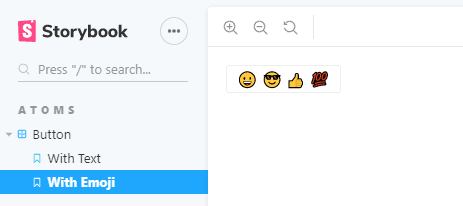
この例だと Storybook からは、ATOMS カテゴリの Button グループに、With Text と With Emoji という 2 つのストーリーが定義されているものとして扱われ、Storybook に表示されます。
上記の例に加えて、属性側に「どの関数をストーリーとして扱ってよいかの指定」などを行うことができます。詳細は Storybook のドキュメント を参照ください。
Storybook と react-testing-library で CSF を利用
実際に CSF を作ってみて、それを複数の環境から使用してみましょう。
具体例として、カウンタコンポーネントとその CSF を作成して、それを Storybook と react-testing-library でのテストの双方で使用する例を作成します。
カウンタコンポーネントには、props として button へ disabled を与えることができるようにします。これを状態のパターンとして、Storybook ではレンダリングし、react-testing-library では実行時テストの対象とします。
Counter コンポーネント
import React, { useState } from 'react';

interface CounterProps {
  disabled?: boolean;
}

const Counter = ({ disabled }: CounterProps) => {
  const [count, setCount] = useState(0);

  return (
    <div>
      <p>{count}</p>
      <button disabled={disabled} onClick={() => setCount(count + 1)}>
        increment
      </button>
    </div>
  );
};

export default Counter;
Component Story Format
import React from 'react';
import Counter from '..';

export default { title: 'atoms|Counter' };

export const initial = () => <Counter />;

export const disabled = () => <Counter disabled />;
initial と disabled という、2 種類の状態を閉じ込めた Story を定義しました。この CSF が、Storybook と react-testing-library の両方で使用できるかが、今回検証したいところです。
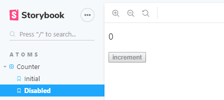
Storybook による CSF 利用
yarn storybook を実行してみます。期待通り、Storybook が CSF を自動的に認識し、ストーリーとして表示してくれました;
react-testing-library による CSF 利用
CSF ファイルには、initial/disabled の 2 種類の状態を定義しました。これが正しく挙動するかどうかについては、ボタンクリックイベントを発生させて確認したいところです。react-testing-library で動かしてみましょう。
テストファイルで CSF を import して、enabled/disabled の 2 種類の状態パターンとして利用します。click をボタンに対してトリガして、カウンタ値が期待通りに変化するかについて、テストを書きます;
import { render, fireEvent } from '@testing-library/react';

import { initial, disabled } from '../__stories__/index.stories';

describe('counter interactivity', () => {
  it('should increment when enabled', () => {
    const comp = render(initial());
    fireEvent.click(comp.getByText('increment'));
    expect(comp.getByText('1')).toBeTruthy();
  });
  it('should do nothing when disabled', () => {
    const comp = render(disabled());
    fireEvent.click(comp.getByText('increment'));
    expect(comp.getByText('0')).toBeTruthy();
  });
});
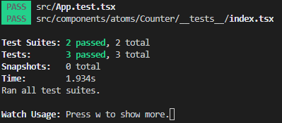
yarn test でテストを実行します。無事にテストをパスしました!
まとめ
Storybook v5.2 で新登場した Component Story Format は、ストーリー定義を「特定の状態のコンポーネントの例をレンダリングするコードスニペット」として扱うことができる仕組みです。
コンポーネントと状態をセットにして、関数として export することでポータビリティが大幅に向上し、Storybook だけではなく、テストやドキュメントなどにも、コンポーネントの様々な状態を提供できるようになります。
それを今回、具体例として、カウンタコンポーネントの disabled 状態について CSF で定義し、見た目の挙動については Storybook で、イベントハンドリングの挙動については react-testing-library で、2 つの側面からテストできることが確認できました。
ストーリーが可搬性を持つことで、単に Storybook のためだけに書いていたコンポーネントの状態を、様々なツールに応用できる環境が整いました。対応するツールが増える可能性も高いと思います。期待して素振りを続けます!
完成品
実装したリポジトリはこちらです;
https://github.com/suzukalight/study-storybook-component-story-format